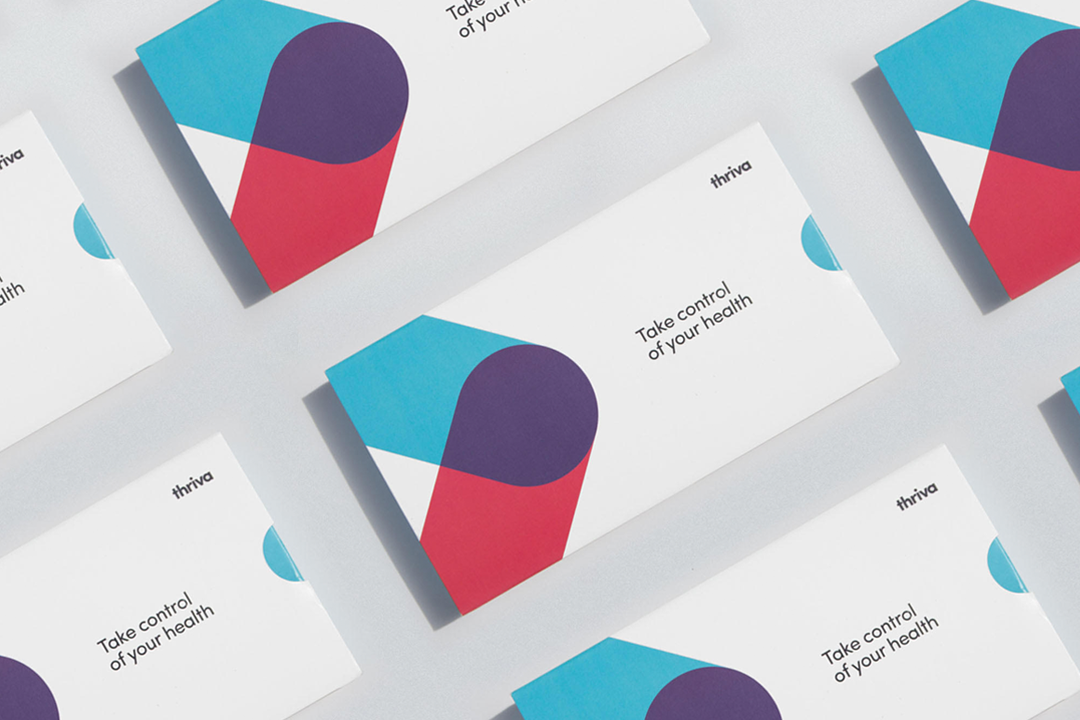
Thriva
Overview
Thriva is a healthcare startup providing blood tests that you can take at home. Working in small product team, I lead the work around the optimisation of the core product as well as designing, testing and launching new features.
What I Did
When I joined, the product was nearly 2 years old and beginning to scale. Together with the product team, customer service, medical staff and copywriter, I led cross-functional workshops to align on business needs, conducted user interviews to identify gaps, and used analytics to drive and measure improvements. Some of the output of that work focused on:
- Unifying the visual design for a consistent user experience
- Simplifying medical content to make it more user-friendly
- Increasing test completion rates with clear digital instructions
Creating a cohesive visual experience
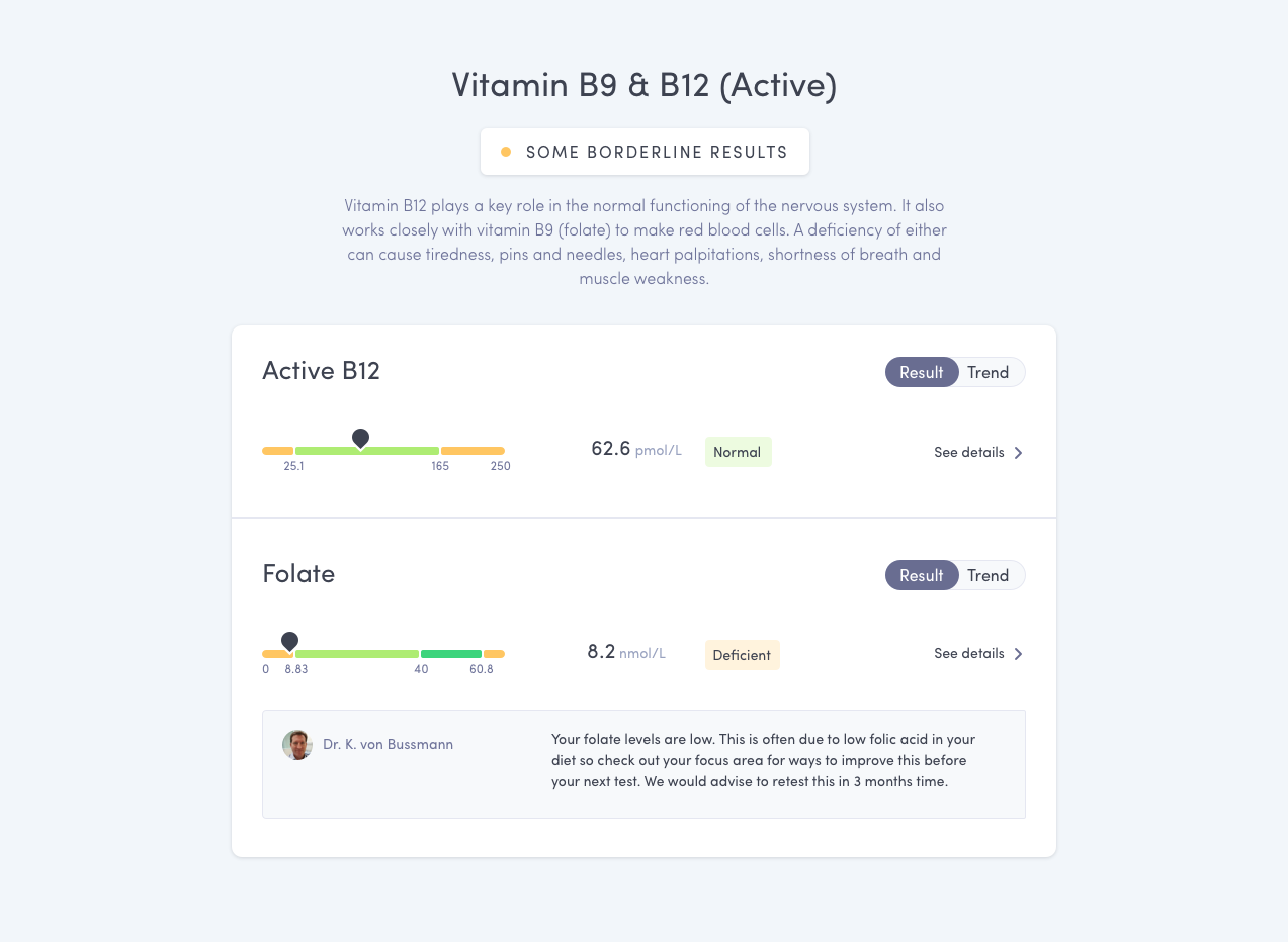
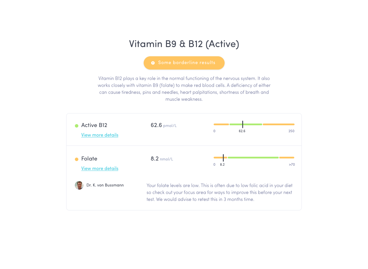
Thriva helps users understand their blood results—what's good, what's not, why, and what to do next. To support this, we redesigned the results page for clarity, accessibility, and ease of use.
Key improvements:
- Color accessibility: The old design used unclear and non accessible color indicators that confused users i.e. colored circles to indicate the severity of the result. We introduced accessible colors and added clear labels like "Normal" or "Deficient" for better clarity.
- Content scannability: I restructured the layout to follow natural reading flow and made doctor comments more visible, with clear separation between results.
- Information discovery: Users can now explore individual results in more detail and view historical trends from the same page. We added clear calls to action, grouped interactions in one area, and used visual cues like toggles and chevrons to guide users to deeper insights.
Making medical content clearer and more accessible
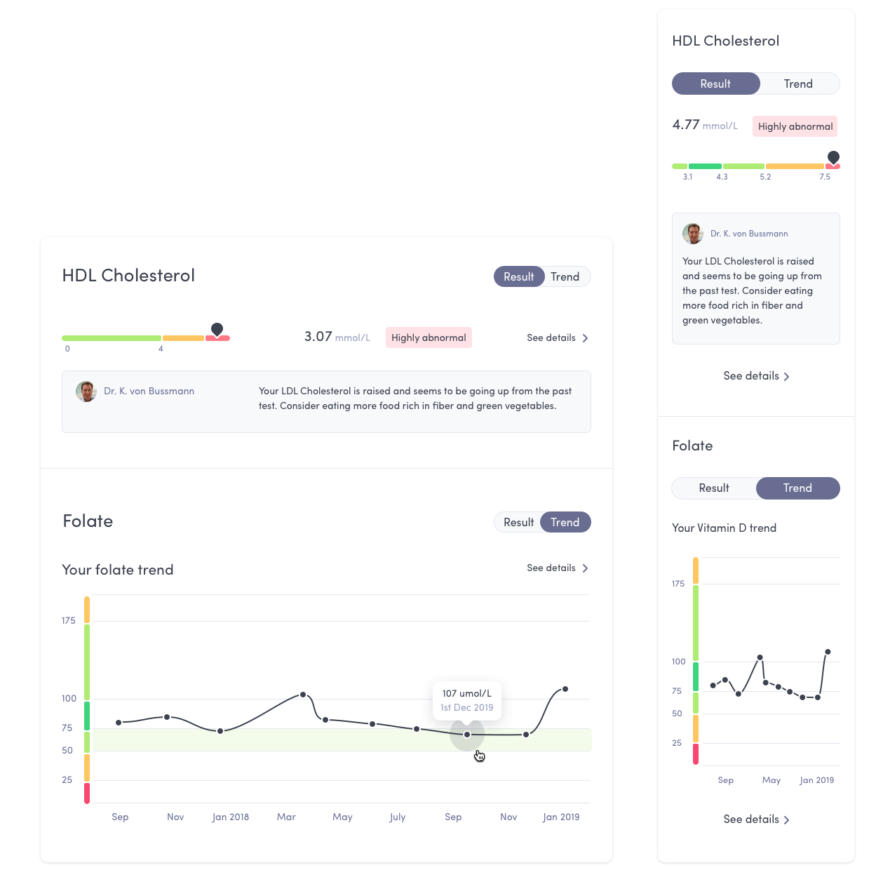
Users loved tracking their blood levels over time, but the historical graph was hidden behind a small link and rarely seen. I pushed to surface this feature earlier in the experience. With a simple toggle, users can now switch between a result and its trend without leaving the page. It remains one of the most-used features today.
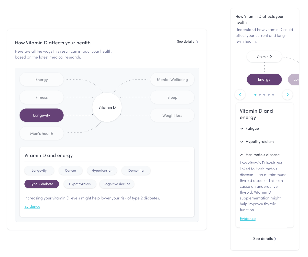
Bringing context to test results
We launched the Spider Graph™ to show how each test marker connects to areas like sleep, longevity, and more—using the latest medical research. I worked closely with the medical and copy teams to make this information clear and approachable, while adapting it to design constraints like character limits and screen sizes.
Improve the test results success rate
Many users struggled to complete their blood tests correctly, leading to drop-offs and refunds. I led an experiment to replace paper instructions with digital, interactive guidance. The goal was to reduce failure rates by addressing common user errors more effectively.
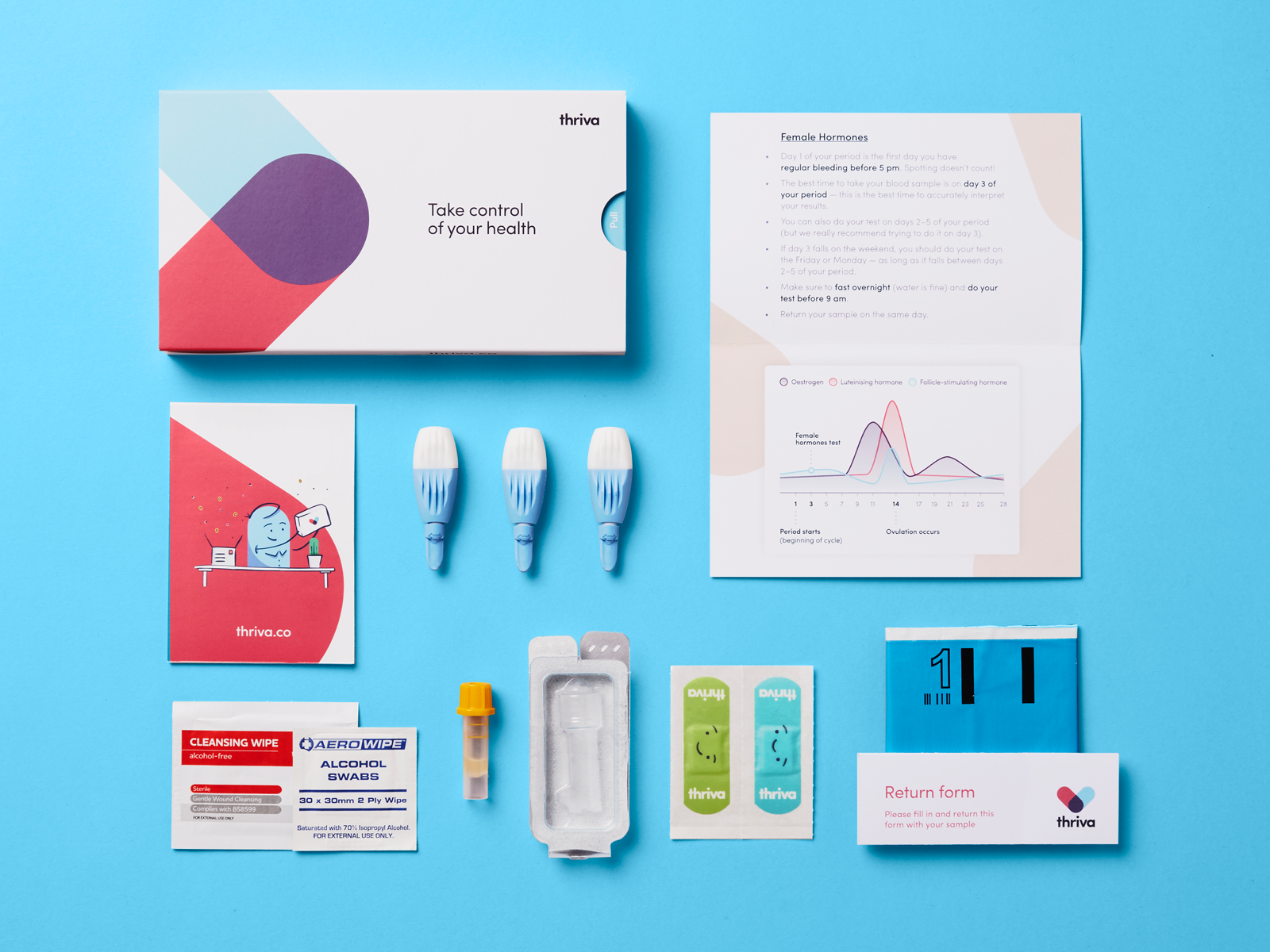